Imagine walking into a store where everything just makes sense — a perfect example of modern retail interior design. The fruits and vegetables greet you at the entrance — fresh, colourful, and beautifully arranged — showcasing the power of visual merchandising in retail design. The aisles are wide enough to breathe, reflecting thoughtful retail space planning and store layout optimization.
The lighting is warm yet perfectly clear, enhancing product visibility through a well-planned retail lighting design strategy. Every section is exactly where you would expect it to be, marked with bold, confident signage that makes navigation completely effortless — a true example of wayfinding design in retail interiors and customer-friendly store layout design. You came in for three things, and you are leaving with seven — happily — demonstrating how effective customer experience design in retail and strategic commercial interior design can directly influence buying behavior and increase sales.
Now imagine that store is in your city — in Mathura. That is precisely what ArchitectsHive designed and delivered in Chandanvan — a 1,700 sq. ft. modern retail store design in Mathura that completely redefines what everyday shopping can feel like in a Tier-2 city. Completed in just 82 days, this commercial interior design project in Uttar Pradesh is living proof that world-class retail interior design in India is not reserved for metro cities like Delhi or Mumbai. It belongs right here, in the heart of Uttar Pradesh, serving the people who deserve a premium, organized, and experience-driven retail environment.
This project stands as a benchmark in grocery store interior design, visual merchandising, and commercial architecture in Tier-2 cities, showcasing how thoughtful design can transform everyday retail into a powerful business advantage. This is how it came to life.
Mathura's Shoppers Have Changed — Has Your Store Kept Up?
Mathura is growing rapidly. New neighbourhoods are expanding, household incomes are rising, and a new generation of local consumers is shaping their expectations through exposure to organized retail across India. Today’s shoppers in Chandanvan understand what a well-designed store feels like. They can instantly recognize the difference between a cluttered, poorly lit shop and a clean, organized, and thoughtfully executed modern retail interior design.
This shift in consumer mindset has made retail store interior design in Mathura a critical factor for business success. A professionally designed retail space is no longer a luxury — it is a necessity for brands that want to stay competitive in today’s evolving market. From retail space planning and store layout optimization to visual merchandising and retail lighting design, every element directly impacts how customers interact with the space.
A well-designed store enhances customer experience in retail, increases average time spent inside the store, and ultimately drives higher conversions and repeat visits. This is why commercial interior design in Uttar Pradesh is becoming one of the most powerful tools for retail business growth.
For retail owners, investing in grocery store interior design or modern retail architecture is one of the most reliable long-term decisions — delivering consistent returns through increased footfall, stronger brand perception, and higher revenue generation every single day.
ArchitectsHive recognized this opportunity from day one. Every design decision in this project reflects a deep understanding of retail design strategy, customer behavior, and high-performance commercial interiors — ensuring that the space is not just visually appealing, but also functionally and commercially successful.
Walking Through the Design: Zone by Zone
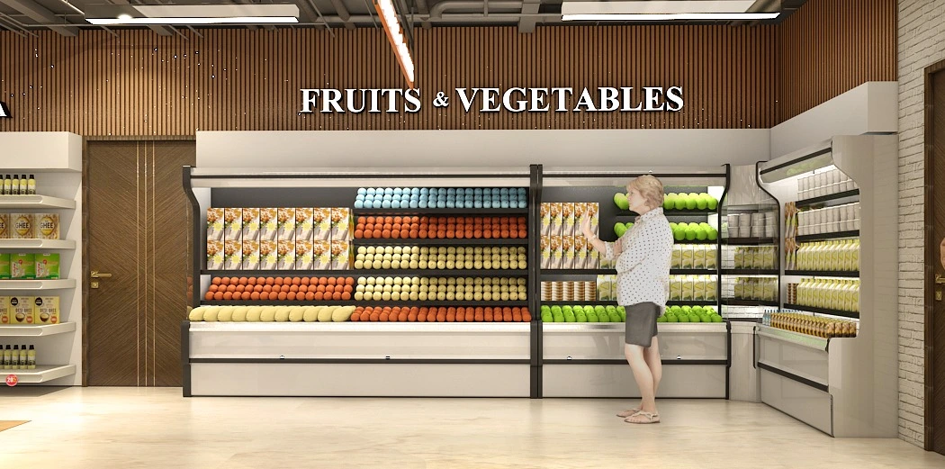
The Entrance — Fruits and Vegetables: The First Five Seconds That Sell Everything
The moment a customer steps into this store, they are greeted by a wall of pure color — vibrant oranges, deep reds, golden yellows, and fresh greens, arranged in beautiful horizontal rows across a premium refrigerated open-front display unit. This striking first impression is a perfect example of visual merchandising in retail design, where product presentation itself becomes a powerful sales tool.
Placing the Fruits and Vegetables section at the entrance was one of the most commercially intelligent decisions in this entire retail store interior design project. According to proven retail psychology, fresh produce at the entrance sets the emotional tone for the entire shopping journey. When a customer’s first sensory experience is colour, freshness, and natural abundance, it instantly builds trust and perception of quality — a key principle in customer experience design in retail.
This approach is widely used in modern grocery store interior design and retail layout planning, where the entrance acts as a high-impact zone to attract, engage, and retain customers within the first few seconds.
The design execution of this section is equally refined. Premium refrigerated display fixtures in a sophisticated dark and white finish give the space a professional, almost architectural character — reflecting high-end commercial interior design standards. Behind the display, warm wooden slat wall paneling introduces natural texture and depth, a key element in modern retail interior design in India, ensuring the space feels inviting rather than clinical.
Overhead, bright linear fixtures showcase a well-planned retail lighting design strategy, ensuring every product is perfectly illuminated to enhance visibility and appeal. This not only improves aesthetics but also directly influences buying behavior — a core principle of retail space optimization.
The marble-effect floor tiles complete the experience by adding a sense of openness and premium quality, aligning with the overall store design concept. This is not just decoration — it is a strategic blend of commercial interior design, retail branding, and space planning, working together to drive customer engagement and increase sales.
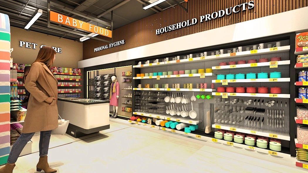
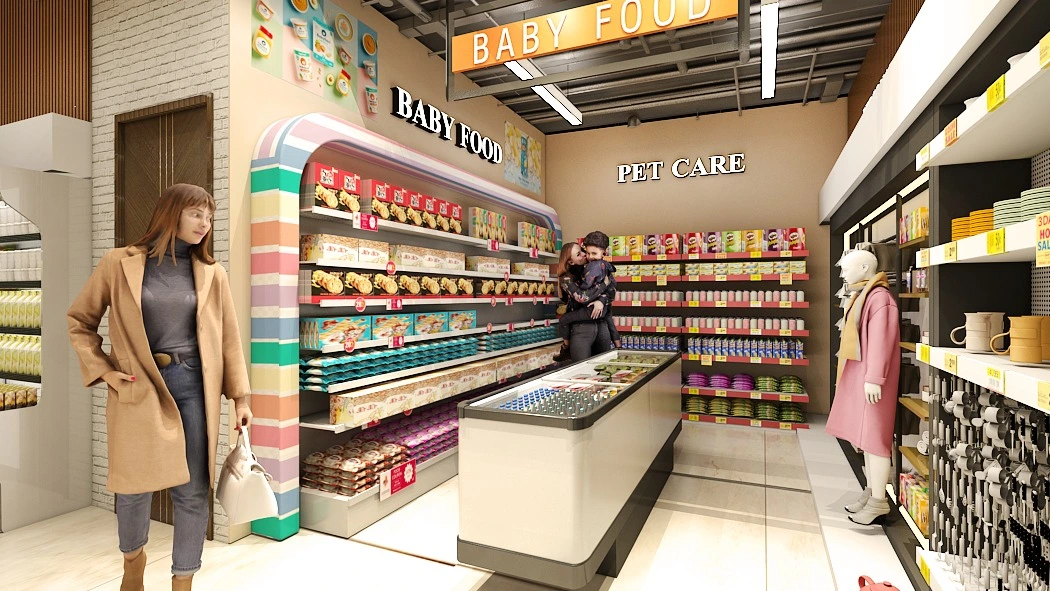
The Heart of the Store — Baby Food, Pet Care, Personal Hygiene, and Household Products
Moving deeper into the store, the design opens into a brilliantly organized multi-zone environment where four distinct product categories — Baby Food, Pet Care, Personal Hygiene, and Household Products — each have their own clear identity while feeling part of a unified, coherent whole.
The Baby Food zone is the most emotionally powerful design element in the entire store — a custom-designed arched display unit wrapped in soft pastel tones of pink, peach, mint, and lavender. This is not standard retail shelving. It is a destination. The arch shape communicates welcome and safety — one of architecture's oldest symbols of invitation — and in soft, nurturing pastel colours, it tells every parent who approaches: this space was designed with your child in mind. That emotional resonance builds trust, drives purchases, and creates the kind of loyalty that brings customers back week after week.
The Pet Care section sits adjacent, with a clear, bold overhead sign and well-organized horizontal product displays that signal variety, abundance, and genuine curation. Pet owners are intensely loyal shoppers. A store that shows it takes their needs seriously earns that loyalty completely.
The Household Products wall at the rear of this zone is equally impressive — a full-height dark pegboard display lined with cookware, utensils, bowls, and kitchen essentials in a color-rich arrangement that is genuinely enjoyable to browse. The dark backdrop makes every colorful product pop dramatically, turning a functional shelf into a visual experience.
Overhead, an industrial-style exposed ceiling with structured LED track lighting ties the entire space together — modern, dynamic, and visually interesting without ever becoming distracting.
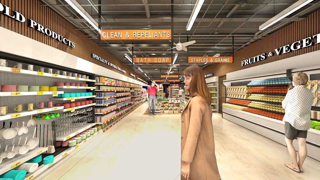
The Main Aisle — Where the Full Ambition of the Design Is Revealed
Standing in the middle of the store and looking down the main aisle is the moment when the full scope of this design becomes clear — and it is genuinely breathtaking. This perspective highlights the strength of retail space planning and store layout optimization, where every element is aligned to enhance both functionality and visual experience.
On both sides, well-organized product zones stretch across the full depth of the store, showcasing a highly efficient retail zoning design strategy. Bold orange suspended zone signs hang from the industrial ceiling — Clean and Repellents, Bath Soap, Staples and Grains, Specialty and International — each one clearly visible from the entrance. This level of clarity reflects strong wayfinding design in retail interiors, allowing customers to instantly understand the store layout. A customer standing at the entrance can locate every section before taking a single step — a key principle of customer experience design in retail.
This clarity reduces friction, minimizes decision fatigue, and increases the time customers willingly spend inside the store — directly contributing to higher engagement and conversions.
The main aisle is wide, generous, and completely unobstructed, demonstrating thoughtful retail circulation planning. Two customers with shopping baskets can pass each other comfortably without interruption. While this may seem like a minor detail, it plays a critical role in retail space optimization. Cramped aisles are one of the leading causes of early store exit in Indian retail environments. When customers feel physically restricted, it creates stress, and stressed shoppers tend to leave earlier and spend less.
By ensuring optimal aisle width through strategic commercial interior design planning, this store enhances comfort, encourages longer browsing time, and ultimately increases the average basket size — a crucial factor in retail business growth.
The warm wooden slat paneling runs continuously along both sides of the store, creating a cohesive and inviting environment — a signature element of modern retail interior design in India. This consistent material palette strengthens the overall retail branding through interiors, tying every zone together seamlessly from entrance to rear wall.
The marble-effect flooring maintains a premium and spacious feel throughout, while the industrial ceiling design adds height, openness, and a contemporary character — key features of modern commercial interior design. Together, these elements create a store environment that feels larger, more organized, and visually balanced.
This aisle view stands as definitive proof of what great retail interior design truly delivers — a space that is efficient, customer-centric, visually premium, and commercially powerful from every angle.
The Design Language That Makes This Store Unforgettable
Looking at this project, what stands out is not any single design element — it is the consistency and intentionality of the complete design language.
Warm wooden slat wall paneling appears throughout the entire store — behind the produce display, along the aisles, framing the household section. This single material choice elevates the entire interior, adding natural warmth and texture that prevents the store from ever feeling cold, generic, or institutional. It is the design thread that connects every zone visually.
The bold orange and white zone signage system is consistent, legible, and confident throughout the store. Every product category has a clear identity. Customers learn the store's language on their first visit and navigate it effortlessly on every visit after that.
The industrial exposed ceiling creates height, openness, and a contemporary energy that few grocery stores in Tier-2 India have achieved. Paired with the warm natural materials below, it produces a balance between modern dynamism and comfortable warmth that is genuinely difficult to achieve — and ArchitectsHive nailed it.
Comprehensive LED lighting design ensures that every corner of the store, every shelf, and every product zone is perfectly illuminated. There are no dark corners or shadow zones that make products look dull. The lighting is layered — ambient fill lighting throughout, task lighting over shelving, accent lighting on key displays — creating an environment that is bright without being harsh.
The Conclusion: This Is What Retail Design in Mathura Can Look Like
These four design renders represent something genuinely significant for retail interior design in Mathura and across India’s rapidly evolving Tier-2 cities. They highlight how modern retail store design in India is transforming the way businesses operate and how customers experience everyday shopping environments.
They prove that a 1,700 sq. ft. grocery store interior design project — built in just 82 days in Chandanvan — can look and function like a premium organized retail destination. This is a benchmark example of commercial interior design in Uttar Pradesh, where thoughtful retail space planning, store layout optimization, and visual merchandising come together to create a high-performance retail environment.
More importantly, it reinforces that Indian shoppers in smaller cities value and expect premium retail design, customer-centric store planning, and modern commercial interiors just as much as shoppers in metro cities. With the right approach to retail design strategy and consumer behavior understanding, even Tier-2 markets can achieve world-class retail standards.
This project demonstrates how an experienced design team can combine commercial architecture, retail branding, and functional space planning to deliver not just aesthetics, but measurable business results.
ArchitectsHive did not just design a store — they created a powerful business advantage. Through strategic retail interior design, they have built a space that will consistently drive higher footfall, strengthen customer loyalty, and increase revenue over the long term.
That is the true impact of professional retail interior design services in India — and that is exactly what has been successfully delivered in Chandanvan, Mathura.
For More Detail Visit - 🌐 https://architectshive.com/
📞 +91 75034 68992 | +91 99586 00397
✉️ contact@architectshive.com
📍 Serving: Ghaziabad | Noida | Greater Noida | East Delhi | West Delhi | North Delhi | South Delhi | Faridabad | Gurugram
#ArchitectureConsultancyInNoida #ArchitectureConsultancyInDelhiNCR #CommercialArchitecture #ArchitectFirmsNearMe #CommercialBuildingDesign #FacadeDesignNoida #VastuCommercialDesign #ArchitectsHive #NoidaCommercialArchitecture #ModernCommercialDesign #HouseDesign #HomeDesign #InteriorDesign #ModernHouseDesign #BestArchitectsInGreaterNoida #ArchitectsInDelhiNCR #HomeConstruction #ResidentialArchitecture #LuxuryHomeDesign #ContemporaryHouseDesign #SustainableArchitectureIndia #EcoFriendlyHomeDesign #CustomHomeDesign #VillaDesign #2BHKHouseDesign #3BHKHouseDesign #SmartHomeDesign #ArchitectureAndInteriorDesign #CompactHomeDesign #EnergyEfficientHome #InteriorDesignersInNoida #FullHomeInterior #ExteriorHomeDesign #MinimalistArchitecture #VastuCompliantHouseDesign #ArchitectsInAligarh #BestArchitectsInUP #IndependentHouseDesign #DoubleStoreyHouseDesign #ModernHomeConstruction #ResidentialInteriorDesign #ContemporaryArchitectureIndia #ArchitectsHive #BestArchitectureFirm #HireArchitectForHome #BestArchitectNearMe
Gallery